Friday, March 30, 2012

DIY Gallery Wall

I debated posting this or not. I couldn't decide if I wanted to wait until it was completely finished, or if I should just go ahead and do a mini-reveal now. Clearly I went with the latter! Here is our gallery wall in our (still unpainted) family room as of today:


Woohoo! Progress is progress right? Honestly I decided to post now, because I have no idea when I will finish it. I think I have decided to have a family photo session done this Spring/Summer and sort of coordinate the wardrobe a bit for the space. I went back and forth about just putting all sorts of random family photos in it now and doing the fresh session and have all the photos be coordinating. I think that I would like it better if I went with the new session. Then I can plan it out, colorwise, the way I want it. I am also planning on intermixing some swatches of fabric in some of the frames too. So, you'll just have to be patient and wait for the final product sometime this summer.

Why, do you ask, did I decide to put the frames up now then?? Well. At the time I had assumed I would just fill them with photos we already had. Also, this wall was SO blank and empty, I really just wanted to put something up there. Plus, I figured hanging it BEFORE we painted might be a good idea. In case I needed to make a bunch of extra holes or something (which I didn't).

Let's take a peek at how the wall evolved, shall we?

First off. I went to Michaels and browsed around for all white frames. I lucked out in that they had JUST (as in, that week), come out with a new line of white gallery frames on the cheap. They were significantly less expensive than the frames I had found at Target and Ikea. Well, assuming I could use a coupon, that is. Actually, even without a coupon they are a great price.

Here is the photo I snapped on my phone of the display:

As a frame of reference (ha), the largest frame on the bottom is $19.99 regular price, and the smallest one is $5.99. Very reasonable. Of course, I used a 25% off your entire purchase coupon. It ended up costing me just about $100 for all of them.

While I was there, I really had no idea what frames I needed. What else was I supposed to do to figure it out? So I started just laying them all out on the floor. I knew I wanted it to be a certain width (just about 10 inches wider in total than our sofa), I also knew I wanted them to be in one large frame. For all the frames to combine to form one large rectangle. So I just fiddled with them all until I was happy with the result.

Then I snapped a pic to remind myself of how to set it up at home.


After a couple of weeks I decided to tackle the hanging. Steve was working on another project, and I wanted to see if I could do the entire thing by myself!

Step1) Lay wrapping paper out on the floor. I taped two pieces together to get the right height.

Step2) Start laying your frames onto the paper, copying the layout you previously decided on (ie me looking at the pic on my phone).

If you haven't already done your layout, cut your paper to the size you want the gallery wall to be. Then use that as the parameters for where to place your frames.

Step 3)Outline all the frames on the paper. I used a pencil to trace each frame. Then I cut the wrapping paper around the frames.

Step 4) Take all the frames off the paper and mark on the paper, with a writing utensil, where each frame needs to hang. I just turned each frame over, noticed where the hanging bracket was and marked it with a cross. So, I would see that it was 2 inches down from the edge in the middle, then mark that spot on the paper.

Step5) Hang the wrapping paper on the wall exactly where you want the mural to be. I used tape. This is the only spot I actually needed another set of hands. Steve held one side while I taped the other up.

Here is one with the flash so you can see a little bit better all the outlined frames. Sorry, you still can't really see them since I used a purple highlighter.

Step6) Pound a nail into each spot that you marked for hanging. Right through the paper.

You can see I also marked the size of each frame. Just in case I needed it.

Here is me, hard at work. (Not really, it took only about 30 seconds to do them all!)

Step7) After all the nails are in, carefully rip the paper off the wall.

YAY!! Nails are all in and I didn't have to make ANY extra holes!

Step8) Now, using the paper as your guide for placement, hang all the frames into their position.

Step9) Enjoy your DIY gallery wall!

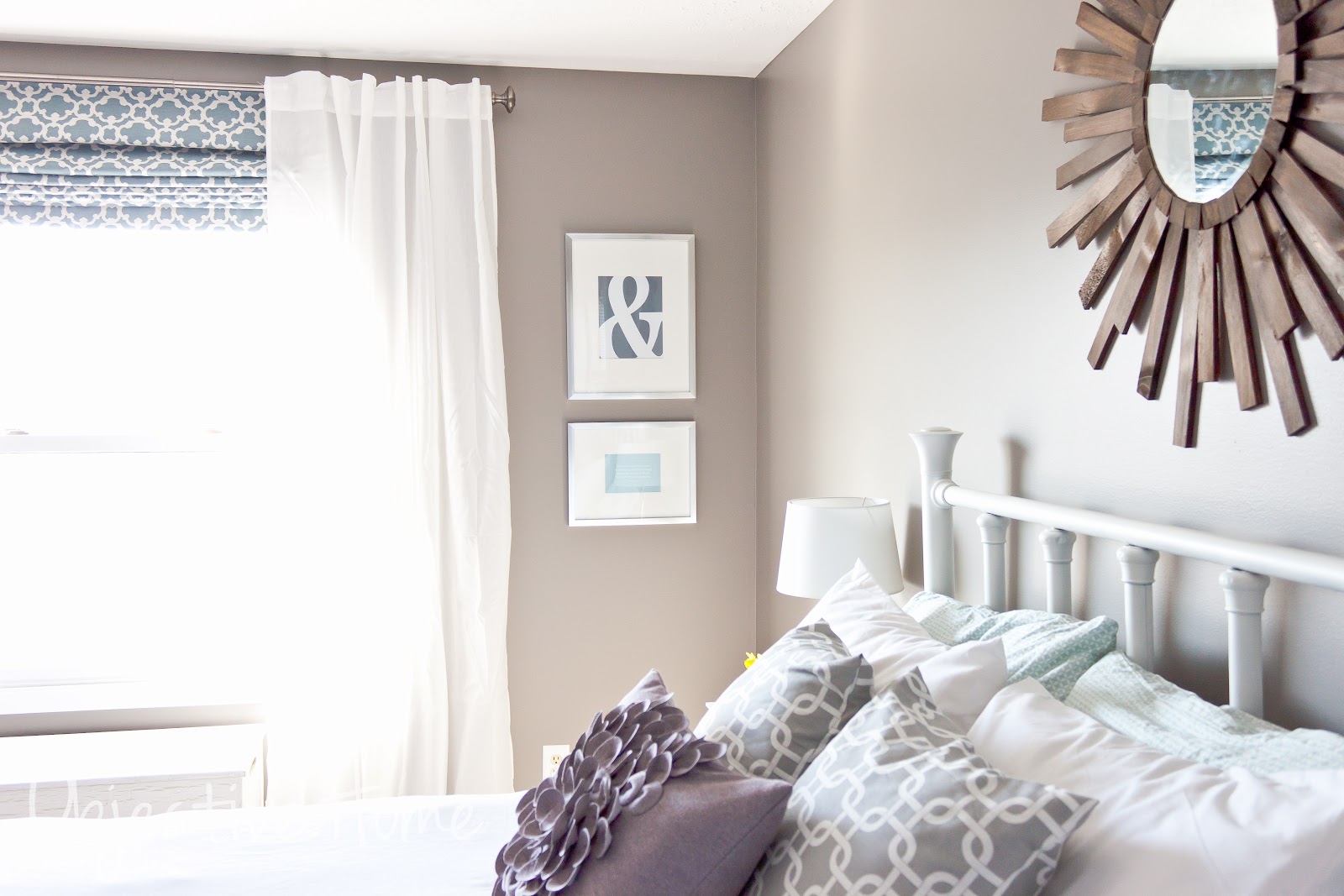
Here it is in the sunlight.

Oh I would love to replace those lamps....

You would be surprised at how simple it really was! The work at home took 30 minutes max and I didn't have to fix any nail holes. I am definitely loving the look, so much better than the big empty space before.

Now I just have to book a session for some family photos to fill those babies up! I also can't wait to paint the room so that we can see how they look on the light gray walls.

This weekend hopefully we'll put a dent in a pretty big project we've begun- the shelving unit on the wall with the tv. YAY! I'll talk a bit about it as we go along. See you soon!

Tuesday, March 27, 2012

YOUR Home.

PHEW. Looking back on the last 3 months, we sure have come a long way here in our humble abode. We have been very busy scratching things off our astronomically long list of projects we would like to putter on. Long nights and full weekends of tinkering and shopping and repurposing and painting and NOT sleeping.

Sometimes we (is it just me?) get in the mind set of wanting to do it ALL right.now. Right NOW. Not later, now. Never mind the fact that we plan on being here a couple handful of years. We just get to thinking that we have to complete the entire property ASAP. Well. That just isn't realistic or even ideal, is it?

Ideally your home has a well thought out, well collected look. You don't want it to look like you just went out and purchased everything out of catalog XYZ and called it a day. You want it to look like YOURS. Lived in. Loved. A mish-mash of all the things you hunted for and uncovered, that were perfectly suited for YOUR home. Not the cute, adorable family next door, or the swanky people down the street. Yours. Ideally, it's not cookie cutter. Because if you're like me, you tried that. Then you wondered why it didn't feel right.

So. Let's slow things down a bit and remember that your home is YOUR HOME. Take it easy people. I like to think of decorating your home like a treasure hunt. You keep your eyes out for the "treasures" and then slowly and mindfully put the pieces together to form YOUR HOME.

But you know, not every idea is or has to be original to be YOURS. If we were all capable of producing gorgeous, perfectly put together spaces without help from anyone else, well, we'd all be designers. Honestly, even designers pull their inspiration from other designers. Pick and choose the pieces/elements you are drawn to from others, and collect them together to form YOUR space. Your uniqueness can come from the way you creatively combine the legwork that others have already done. Add in touches of your family throughout the space, and shoot, there you go. YOUR home.

So how do you direct your search? Pinterest is great for collecting images you gravitate towards, to help you "pin"-point your style. Same idea with decorating magazines. Sometimes I'm not so sure of the direction I want to head in for a space. I head to Pinterest or my file of magazine pages I've ripped out, and take a peek at the rooms I've gathered. What is it about each photo that attracted me? Are the paint colors aLL similar? Furniture the same tones? Are the rooms classic? Modern?

When I was trying to plan our bedroom, I just couldn't decide on bedding. I must have purchased and returned five sets. So I took a minute and carefully studied the images I had collected of master bedrooms. WHY had I been drawn to them? I noticed right away that every single one of the rooms used white bedding. HUH. Isn't that a coincidence. Well, maybe I should try out white bedding. Lo and behold, I found a $12 clearance duvet, stuck our down comforter in that baby, and BAM. There it is. There is the feel I was trying so hard to achieve and was so miserably failing at capturing. Why couldn't I figure that out before!

Same thing goes for furniture. Need a new sofa and don't know exactly what you want? Browse through the rooms you were drawn to. I have had 4 sets of sofas in the last 8 years (thank you Craigslist for feeding my problem, by giving me a way out of a bad choice). I finally feel like I've reached the point where for the first time, I made a good investment on our furniture choice. I used the same technique as with our master.

I think we don't cut ourselves enough slack. We want it all and we want it all NOW. If we don't have that, then we get angry and sulk. We think we aren't as good as so-and-so. We most certainly couldn't have a home like that. Our home could never be as nice as that. I could never do that. Take it easy folks. Creating your home isn't about comparing your space to everyone else's. It is about loving the space your in. You CAN have a home that feels like that but is your own. Just take it one piece at a time. One element at a time. Soon enough, at a reasonable pace, you'll be on your way.

Let's not compare ourselves in this process of building our homes, but maybe encourage one another.  It's just decorating for goodness sake. There are so many more important issues to deal with. Let's keep the decorating stuff fun and light and collaborative.

See you soon friends!

Thursday, March 22, 2012

Old Lady Junk Turned Narnia Portal


Steve thinks this mirror looks like a portal to another world. To Narnia. He thinks it is funky because the frame of this LARGE mirror is so thin. SO it looks like a portal. Well, better to be a Narnia portal than the gaudy old gold thing it was before!

This past October I was at the Ronald McDonald House Sale and from across the room I spotted this baby. The very moment I saw it, I said, "GAH! I must have that! In turquoise!". I scooted my little booty over to it and beamed at the $20 tag. NICE. It was crazy gold and very old lady-esque, but I saw past all that and only saw the fabulous curvy lines. Unique and purrrrrrdy! Have I mentioned how much I love the RMH Sale??? Why oh why is it only once a year??!! I have gotten the best finds from that place.

Well, it sat in storage (we were living with my father in law while we waited to close on the house) for awhile, and then sat in the dining room (currently our staging room for projects) for a couple of months. I needed some warm weather before I could work on it, and finally last week's weather fit the bill.

Here it is before:

Look at that finish. OK, so I realize some people may well really like this gold/bronze hideousness. You might be cursing my name for not sharing your fondness. Well, I'm sorry. It had to go.

First things first, I had to grab my arsenal. Spray primer in white, and glossy jade. I primed it first because a)I didn't want to have to prep the surface at all (sand, clean etc) because of all the curves, and b)Steve said the jade would cover better and more vividly over white. When it comes to paint, I listen to him. Usually.

The primer we had already, and the jade I picked up at ACMoore with a 50% off coupon for something like $3.

Step 1) Thoroughly cover the mirror. I used wax paper to shove underneath the frame (which took forever since there were so many curves) and a piece of plastic wrap once the wax paper ran out.


Step 2) Find your spraying location outside (I would never suggest spraying anything inside your house, fumes and over spray would be wicked) and cover your painting area. I sprayed in our garage because it was SUPER windy out that day. I used an old white fitted sheet. It doesn't have to be fancy schmancy stuff here peeps.

Step 3) Spray with primer. You want to hold the can about 8 inches away from the item. Also, good rule 'o thumb, "if your paints a sprayin', your arms a swayin'". Basically, when spray painting, never stop moving your arm. Never hold the can stationary in one position. Also, you want multiple, VERY thin coats. Thick coats of paint will a)take FOREVER to dry (multiple thin coats will dry much quicker than one thick coat) and b)drip drip drip all over the place. No one likes paint drips on their work.


At this point I was like, "Wow! This looks really good white. Maybe I should nix the turquoise and go with white instead!". But, I talked myself out of it because this is supposed to be a statement piece. So I begrudgingly pushed away my white addiction and trudged on.

Step 4) Spray with several thin coats of glossy jade. I think I did 4 coats or so. I sprayed it real thinly and then let it dry about 15 minutes before coming back and doing another quick spray. I had to really maneuver my way around this thing because of all the curves and hiding places where spray didn't want to go.

At THIS point I was thinking, "GAH!!!! I ruined it!!! I should have stopped at white!! What was I THINKING??!!!" LOL. I just kept going since there was no turning back now and figured I'd wait to judge it until after all the paper and such was removed. But I was already planning out how I was going to cover it in white.

Step 5) Let dry (I waited overnight) and then pull off all the paper. You might have to use a flat edge razor blade to scrape some paint off the mirror. I had a bunch of over spray, how that happened, I have no idea since every square inch was covered. Oh well. I got the mirror wet and then scraped (well, Steve did).

VOILA!

So I love it!! I think it was turquoise over-kill with all the paper and such. Once I peeled it all away, it was EXACTLY what I was hoping for. PHEW!! (I seem to say that phrase every single time I play with color)

It adds an unexpected swipe of color to the room and it definitely makes a statement. Everyone who has walked in the room since we put it up, raves about it!

I love how it reflects so much sunlight from the window, since they are directly across from each other.

It also perfectly matches the lamp on the other side of the room.

So there you have it. Bright & playful & something to talk about for sure. For $23 or so, it is definitely worth the price!

Wednesday, March 21, 2012

Adding A Bit More Playful To The Playroom

After we got a large chunk of the playroom done last month, and living with it for a few weeks, I decided it needed a bit more color. It was a whole heck of a lot of beige-white-neutral, and not enough BANG! THIS is a playroom! I think a playroom should be playful, for goodness sake. It should look very clearly like a room for kids. Colorful, bright, cheery, fun. At the same time, it IS still my home and I also need it to look presentable and not like a box of Crayola barfed all over the place. There is a fine line I think, and I wanted to figure out a way to liven it up yet stay away from that border.

Enter area rug. The room has wall-to-wall beige carpeting that was here when we moved in, and it left the main play space in the middle of the room looking so bare and plain and boring. I wasn't sure how it would go, throwing an area rug on top of plush carpet, but I took the plunge. It just really needed it! I am very pleasantly surprised at the results. It doesn't bunch much at all, nor does it move all over the place. I am planning on buying the carpet pad for underneath it to completely eliminate the wrinkling, but it is minimal enough that I haven't run out to do it yet. Take a peek.


It really defines and grounds the space! Instead of just a sea of beige, it brings a swash of sunny yellow in to center the room a bit. I am really liking it a lot. I purchased it from Home Decorators Collection online. It is 100% hand woven wool and it is flat woven and reversible. Yes! Reversible! So, not only will it last FOREVER being that it is wool, it will also hold up to kids because if it gets too gunky and drabby, I can flip that baby right over. SCORE.

Not only is it perfect for kids, but it was a great deal. I snagged this 5x8 beauty on sale (HERE) and with a coupon for $125, normally $200. PLUS I got free shipping. I was nervous buying it because it looks very bright and saturated online. I figured though, it was a great price and I could always return it if I didn't love it. Thankfully, it arrived and it was the perfect shade of mustard. PHEW!

As you can see, I also added that turquoise mirror above the play kitchen. I'll post more on that tomorrow actually. I have a bit more to do on that wall, but for now, it adds a Narnia-esque feel to the space. Which is very cool.

I also added a matching turquoise lamp and white garden stool in between the leather chairs. That space really needed a jolt of color because of all the neutral and white. It still needs a bit more, something. I am thinking about doing fabric roller shades (right now they are plain white cruddy plastic ones), but I have yet to find the exact fabric I am looking for.

Anyways, yes. I found that great lamp at Target on clearance (it was the last one!) and the drum stool/side table I picked up at Home Goods for $40. I LOVE it, but it makes the lamp a smidge too short for the chairs, so I might switch things up a bit.


I like how the turquoise pieces are opposite each other in the room. Coordinating, but not TOO matchy like if they were right next to each other.

I am happy with how things are coming together here. Very kid friendly, yet still grown up enough to be the first place people see when they walk in. I still have a couple little things I want to add to the wall with the mirror, to display the kids artwork and possibly a few books, but we'll see.

Among some of the other recent happenings, Steve switched out the ceiling fixture in the entry way for me. It was previously looking like this (this is before we moved in, clearly):

And here it is NOW:


It is a clean & simple, drum shade flush mount. Found HERE from Ikea. I love the texture, and at $29.99, you can't really go wrong. Steve was GENIUS and figured out a way to retro-fit it to the existing light fixture. So all we had to do was remove the glass on the old one and attach this one. No rewiring at all! Bonus.

So things are coming along well here. Adding bits and pieces all over the place. The nice weather the last week has had us focusing a bit on the exterior of the house, which has it's own to-do list. Tomorrow I'll be back to talk a bit more about the transformation of the mirror in the playroom. It went from hideous to cheerful for under $5!

Tuesday, March 20, 2012

Hello Friends!

I'm here! After battling an oh-so-wonderful stomach bug at our house, I spent the last two days enjoying the gorgeous weather with the kiddos. It has been in the 70s and solid wall-to-wall sun, I just couldn't bring myself to be in the house until evening! I'll return tomorrow with some updates that are going on around the joint here.

Thanks for sticking around!

Friday, March 16, 2012

GPS Coordinate Welcome Printable

Up today is a quick how-to on making your own GPS coordinate welcome sign for your humble abode. I'm sure you've seen them all over Pinterest, but it only takes a few minutes if you have a Photoshop program of some type. If you don't, you could feel free to email me (via the CONTACT tab) your coords and I could whip you up one real quick & email it back to you. I'm feeling generous today, what can I say.

Here is the one I made for our entry way:

I changed the numbers up a bit, seeing as I didn't think it was a super wise idea to put our exact location on the internets. But you get the idea.

Want to make one? Well then, let's get crackin!

Step 1) Determine your GPS coordinates. I used THIS website. All you do is put your address in at the top and then it spits out your coords at the bottom of the page.

Here is where you put your address (in the slot marked address, go figure!):

Here is where it comes out (the 6 slots on the bottom):

Step 2) Find a background. To get the chevron pattern, I googled "free chevron background", then clicked on IMAGES. You can get the same one HERE.

Step 3) In Photoshop, use the background you just found, and then add a text box for your coordinates. I also lowered the opacity of the background and the text so it wasn't as dark/bright.

VOILA! Here is an example of another one I made.

I printed it out 8x10 then stuck it in a matted frame. Art for under $10. Right up my alley!
Pin It

Wednesday, March 14, 2012

Master Bedroom Wall Happenings (Free Printables!)

I took advantage of the nice weather yesterday and finally stained the sunburst mirror for our bedroom (tutorial HERE). I was SO nervous as I was staining it because holy smokes, it was dark. It stinks to spend so much time on something and then ruin it with the finishing. I just kept going and hoped it would be ok. I let it dry overnight and this morning it looked PERFECT! I think the dark stain is exactly what I was envisioning for the space. I wanted something dark to contrast all the white, and I think it will tie in with the dark brown leather chair (that I have yet to buy) in the corner and the leather ottoman under the smaller window. Adds a bit more masculinity to the room, which is nice. I want the space to look luxurious and relaxing, and give a nod to the man who also inhabits the space. Nothing TOO girly froo-froo.

I think I might need to move it a tad lower, now that I see the photos. I have a thing about wall decor hung too high on a wall. From what I've noticed, people tend to hang things much too high on their walls. It should be eye level in the center. Obviously, this piece is different, and it was super tricky getting it hung by myself.
 

I am really happy with how the stain allowed the dimension of the wood to show through. You can still see the variation in tones and such, which is what I was hoping for. I didn't want it to lose all definition once finished, which is why I went with stain instead of paint.

I also put together some "art" for the space next to the window. I found the brushed silver frames at Target for 50% off (with mats!) and I printed off the ampersand and the Dr. Suess quote with our printer. The ampersand is perfect for our bedroom, you know, Mr & Mrs, His & Hers, Heather & Steve. Cute stuff there people. For both pieces, it was under $15. Bargain. I chose gray for the ampersand and a gray-blue for the quote.


Printables are a GREAT way to put together very inexpensive "art" for your walls. All you need is a frame & a printer. If you don't have a printer, you could have it printed via one-hour photo at any photo lab for a buck or two. Still very cheap.

I found the Dr. Suess quote HERE and the ampersand HERE. They offer them in all different colors and there are LOTS more free printables on their site. There are so many free printables on the web, just do a search on Google or Pinterest and you'll find a bucket full. You just print them in whatever size you are looking for (I did 8x10 & 5x7), throw them in a frame and call it done! I also have made a bunch myself in Photoshop. Very easy, quick, and a bit more personal.

With the fan addition and the wall hangings, the room has more personality already. Still have to do the other roman, chair and find something for above the dresser. Among other little things. All in all, things are coming together nicely!

Pin It

Tuesday, March 13, 2012

The Breeze Is A Blowin'

Saturday my love and I spent the day together while my pretty mother in law was in town. She watched the babies and Steve graciously took me shopping! We headed out to a sweet old town about 30 minutes away and spent 4 hours browsing around our favorite antique "shop". I say it like that because there are over 1000 dealers, so it is no small joint. I'm sure it was definitely not Steve's number one choice for a day away, but I think ultimately, we were just enjoying each others company without having to talk over the kiddies. We browsed and took our time, discovering all the treasures and laughing at all the junk. In the end, we actually scored an armful of great finds.

Among the scores, are my two favorite pieces. I have been on the lookout for one of these babies for ages! I didn't want to spend a lot (these were $10 & $12) and I was specifically looking for a blue one. When I saw them from down the hall I told Steve, "I don't care how much that blue one is, I LOVE it!!". Imagine my excitement when I saw it was $12!!!


That's right folks, a mid-century desk fan! Look at how pretty it is. All robin's egg blue and shiny aluminum (I think?). It is all metal and heavy and SOLID and just all kinds of gorgeous. Total bonus is, it works! And let me tell you, it works 1000x better than any fan I've ever bought made in this decade. Now, it is a major safety hazard for the kids, seeing as these are BLADES of metal and the cage is tiny, so we won't be plugging them in, but still. SO cool. I am loving it in my bedroom on the dresser. With all the gray and silver in the room, it looks so perfect.

That cute little yellow antique cold cream tin we found for $1 as well. I thought it was a nice touch of color for the room and it is just right for run away earrings and such.
The other one we picked up is just as great. It is gray and has a sweet flower/scalloped design on the cage. Again, works like a charm still and was only $10. This one has found a home on my desk in the family room. Fits in perfectly too.

When we figure out our plans for the wall of shelving across the room, I'll be putting it up there. We were actually looking around specifically for unique items to have on the shelving, and we found a handful of other things too. Just have to decide what we want to do! I can't decide between white floating shelves like this:

Or a more industrial style like this:

Here is another example.
 

Honestly, I am leaning way more towards the industrial look. I feel like the mix of traditional, modern, and industrial, would be so fabulous. Hmmmmm. The thing is, it is a lot more work, and more $$ too. I don't know, don't know. Tossing it around a bit more before I decide. Anyone have any thoughts on this??

ANYWAYS, that was a tangent! So yes, I found a few neat pieces for the future shelving, lucked out with some super sleek fans, snagged a few other fun things, had a great lunch, and most importantly, did it all with my score of a husband. NICE.

In other news, I started a project today and it failed. Here is where I stopped:


I was trying to make a twine covered initial to go on our door, but I just couldn't figure it out after trying a whole bunch of different methods. It was either going to take way too much twine or take me 400 years, so I stopped while I was ahead. Actually, carving that 'E' out of a sheet of Styrofoam was no fun either. I guess I should have quit back when those little balls started sticking all over me via static! You can't win 'em all friends, you can't win 'em all.
Pin It