Wednesday, May 30, 2012

Think Outside The Box.


Today I thought I would do an intro piece for my post on wall hangings. Later I am going to delve into techniques and tricks for decorating your wall space. I'll go into more detail about how to get it right, and give you a handful of good hints for figuring it out in your home. But that's not for today.... 

When we moved into this house, I knew I was going to have get creative. Especially with the walls.

This house is almost twice the size of our last home, and there is about 100x more blank wall space. In our last home, being a 1900s antique house, almost every single wall had either a gorgeous leaded glass window, a doorway with extravagant wood molding, or a beautiful solid wood door. There was just about zero space or need for any wall art. I had a few spots to fill and that was about it.

Enter this house. Built in the last 20 years, with MUCH fewer windows, no fancy moldings or doors. That left a heck of a lot of wall space that cried out to be filled!

I knew I was going to have to get creative with my dollars and hands in order to fill the walls and add some personality into the very boring architecture. Seeing as I had just a small handful of pieces in my arsenal already. Most of which were mirrors (small spaces=lots of mirrors!).

I have already filled a good chunk of the walls, as you have seen in prior posts. Lots of painted canvas, printables, a gallery wall (which is still empty!), DIY sunbursts, and DIY chalkboards. Not to mention all the many mirrors (I am slightly obsessed with the amazing qualities of mirrors in a home). Besides all those things, here are two new ideas that I have recently used in our almost-finished family room.

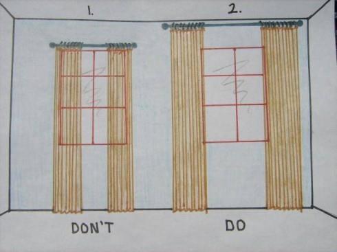
I was trying to figure out how to fill the three narrow walls in the family room. We painted the room (well, 3 out of the 4 walls so far) a lovely gray and we have also finished the industrial wall unit. Between those two elements, there is a lot of texture and darker tones. With the walls, wood, & steel. So I knew I wanted to stick to white frames. I wanted all of the pieces on the wall to tie in together, and seeing as I did the gallery frames in white, and the chalkboard in white, it was a no-brainer.

But what to put in the frames....hmmm. I mulled it over a while and one day I just opened up Ebay on my computer and started looking around. Here is where I ended up.

Don't mind the huge white ottoman in the middle of the room there. We haven't gotten around to putting it in the basement yet.


And grrrrr, I see that the frames are slightly askew in this shot. BA! I hate that. I fixed it, but apparently AFTER I took the photo. Oh well.

Moving on! Let's start with this set of pieces here.


Oh I just love them. I knew I wanted something yellow to add a shot of color to the very neutral wall/shelving unit. After some browsing of different ideas I had rolling around in my head, I ended up searching "yellow nautical maps" on ebay and this is one of the sets that came up. I loved it right away because of a)how bright and graphic they are, and b)they are of Lake George NY! Moderately close to me, and a family vacation spot as well. I also loved how large they are. I am going to talk about scale tomorrow, but I wanted something substantial for this wall because of the large shelving unit right next to it, as well as the large window. I also knew I wasn't going to be putting any furniture in that space, so I wanted to make sure the wall pieces would suffice. Perfect, perfect, PERFECT. Know what's just as perfect??

That's right folks. I picked up all four maps (technically they are one long map), for a grand total of $17. SEVENTEEN!!! You saw how big they are right? How bright? How completely terrific?? Yup. I almost cried. What was just as good was that those lovely white frames were on a huge sale at Michaels and I paid under $10 a piece for them. So for all four framed maps, it was under $60. Something like $55. SCORE.

Look at the lovely detail. I really like how they are worn, a little riped and faded a bit too. Totally adds character and life to them. Plus they are just the most perfect shot of yellow for the space.

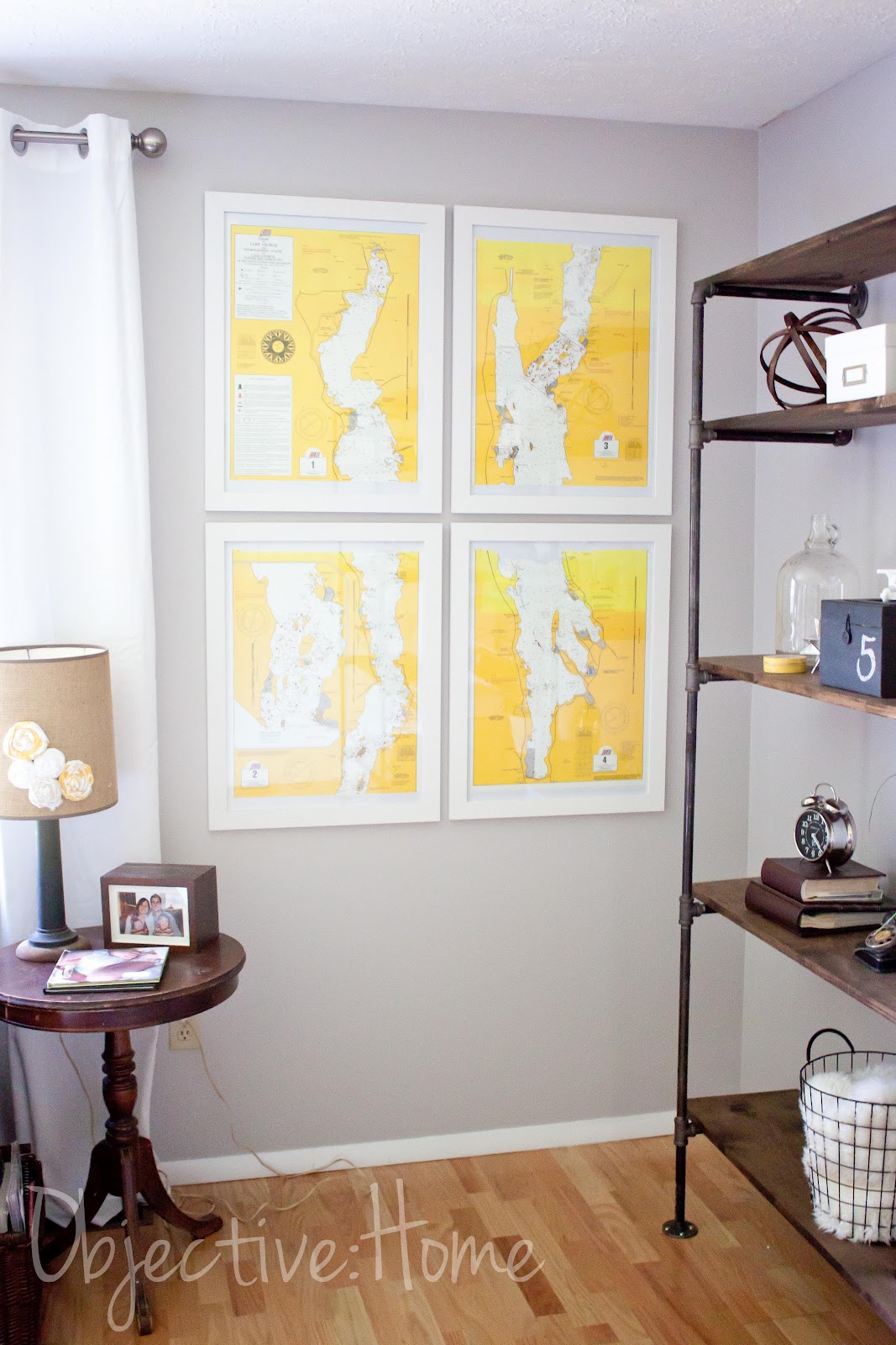
I made sure they were hung just high enough so that little children wouldn't knock into them accidentally. Yet they are still low enough to take care of needing any furniture on the wall. LOVE.

Here is an example of some of the ones you can find on Ebay on a daily basis. This one (there are lots like this) is a bit more subdued in color, but definitely gorgeous.

Up next is a set of four vintage National Geographic ads from the '50s that I stumbled upon. Again, I was on the lookout for a splash of yellow. I also wanted to add some black & white to help tie in the industrial/modern feel. The camera theme is running high in the room now, which I am totally digging. A couple '50s cameras on the shelving, and now four Kodak ads. There are two more, but they are for the unpainted wall, so you'll see those later. These are my favorite two though. GRRrrr with the slight crookedness!!

I love the vintage look, slightly yellowed and faded. I also think it's pretty neat that they all say Rochester, NY on the bottom (which you can't see here). Being that we are in Rochester and all, it is fun that they found their way back "home".


These were also a steal. I paid $2.99 each for them, and since they were from the same seller, I only paid the shipping for one. Woohoo! This is one of the other ones I picked up. I have no idea why it says sold for 5.99, since it was 2.99, but whatev. There is one more, another yellow one, that will hang with this one. The four frames were $5 a piece. So the total was $37 for all four framed pieces.

So. Point being. You can decorate your walls with unique, fun pieces for CHEAP! No one else has these exact sets and I love that. I love how unique the nautical maps are. I love that I didn't just pick them up at Target or wherever. They are one of a kind and completely cool. Take a look around Ebay, there are SO many great things that you can use to give your home personality. Vintage ads and maps ALLLLL over the place.

I'll be back soon with a whole bunch more advice on wall hangings, so watch out!

Tuesday, May 29, 2012

Where Did May GO??

Ahhhhh....I'm here! After a lovely beach vacation, and a week to recooperate & catch up from that, I'm back. It was a refreshing breather, and Steve and I are officially back on the home improvement bandwagon!

Lots of little randoms going on, but the main thing is the deck. This little devil has been quite the project! I think I mentioned that Steve had to dig four more 4 feet deep holes, bringing the total to TWELVE. Yes. That is a depth of 48 feet that he dug! I think he needs to get a prize for that. Thankfully though, it is behind "us" and this past holiday weekend he finished up just about all of the framing. PHEW! He is such a work horse. Here is where we stand.

You can see the upper deck, which will have a railing around it, and the lower ground level deck. Crazy stuff. It is MUCH larger than I was anticipating and we are super thrilled to see it coming together. Decking should be going up within a week or so. YAY!

So, I have a bunch of little things to show you and I'll be back tomorrow with some fun, unique, & inexpensive wall art!

Thursday, May 10, 2012

High & Wide Baby.

Today I wanted to talk about a tip that has helped me quite a bit as I decorate our new home. If you're anything like I was/am, you are challenged in the drapery department. My mother in law worked for JcPenney Custom Decorating for something like 20 years, and I am sure she was appauled at my choice in curtains in our last house. I really had no idea what to do with windows. I suppose I didn't do THAT bad, I went with all white sheers and white romans. No biggie. Except for one big thing. I hung them low and narrow. GASP. As in, basically just covering my windows. Yikes.

So then, as I navigated the decor world over the years, I noticed a big trend that I was NOT a part of. Hanging your window treatments HIGH up on your wall and WIDE on your windows. Why was it not obvious to me before?? What a ginormous impact this single tip has on a room.

Want to make your windows seem twice as large? Make your ceilings feel higher? Room feel more grand? Make a statement instead of just being "there"? Well then my friend, here is your solution. Easy as easy can be too.

Here is an illustration, just so you can get the idea. When I saw this earlier last week, I just knew I was going to have to share it. Because as much as I know the difference, it was crazy to see it drawn out so simply.

This is from Elements of Style.

Now wontcha look at that! BAM. Can you believe that is even the same window???  Drastic improvement.

Along those lines, here are some of my tricks when dressing a window.

-Curtains should be either puddled on the ground a bit, or just touching the ground.

-Hang them within about 3-6 inches from the ceiling.

-That means, no more 84" inch panels. 95" all the way.

-Hang your rod wide enough so that the entire panel hangs just on the outside of the window frame. What I do, is have the panel approximately one inch over the window trim. So JUST covering the molding.

-You can either leave them as is, or if you want more privacy, hang roman shades. I hang  mine directly behind the curtain rod. Waaaaay up high on the wall. By doing this, you'll increase the height of the window and it will appear as though the window continues all the way up.

-With the romans, when they are open, open them so that they are JUST covering the top window molding.

-White panels ALWAYS work in a room. Always. If you have a dark space especially. I almost always go with white. I like to use white panels and patterned or bamboo romans (see HERE for my no-sew roman shade tutorial that has something over 18k Pinterest pins). White just brightens the space and again, makes the window seem much larger. Plus they are just so versatile and timeless. I like grommet top (if you plan on opening and closing them a lot especially) or back tab, which give you a nice pleated look. I steer away from tab top.

-If you want to add color or pattern and don't want to use a roman, you can use white panels and then cut one patterned panel down the middle and add them to the outside of the white panels. Giving you just a splash of color.

-For sliding glass doors, I do the same thing. Our deck slider has the rod hung right under the ceiling, with bamboo shades hung directly behind the rod. I used white grommet top panels so that they can be flung open and closed easily. The door looks WAAAAAAY bigger than when we moved in and vertical blinds were in place. YIKES. Stay away from verticals if you can at all help it. Talk about the '90s!

-For rods, I like large brushed nickel. As in, not the skinny skinny rods. I also like round finials. Classic, traditional, timeless. Honestly though, go with what suits your taste. Oil rubbed bronze and black are also nice.

Here are some examples of the window treatments hung in our house so far. We have only done the family room, master bedroom, kitchen, and partially the play room. I say partially because my plan is to make patterned fabric roller shades or romans. I just haven't gotten on that yet. I am working it around in my head, in terms of what color/pattern I want in there.

Playroom

This is the closest shot I have to a before. Before this though, the previous owner had frilly lace curtains hung directly over and on the window.

I would hang the curtains even wider than this if you can. I didn't because I was trying to use the rod I already had, which was stretched out as far as it would go. If I ever feel like it, I'll buy another rod and pull the panels out 6 more inches or so. Notice how I left the space between the rod and the window bare here. Works just fine. Shades to come eventually.


Master Bedroom

Again, closest I have to a before. This was the previous owners. Waaaaay too low. Too shiny. Mini blinds. Brass tiny rod.

Here is the other window.

After. BAM!!!! Can you even believe this is the same window???
Now I realize this is not the same window as the first photo. But, I haven't finished the other window and this one was dressed the exact same way as the other one was, before I took it all down for the photo above.
Notice the high bar, romans hung directly behind it and opened up right to the edge of the window. White panels hung completely on the outside of the window. This looks like a completely different window. Craziness.

Family Room

Before.
Previous Owners. So much wrong with this.

After
This was before we painted and moved the bookcase out of the room.

The room how it is now, from another angle. I don't know why I don't have a straight on shot. Whatev.

Here are some of my suggestions for inexpensive, versatile, white panels.

TARGET Grommet Top 95" FOR $35 (I have these in my family room and kitchen)

IKEA Back Tab 98.5" (comes with hem tape) for $10 a PAIR (these are the ones I have in my bedroom and playroom)

I think I've illustrated my point here. High and wide baby. Any other window treatment questions??

Saturday, May 5, 2012

Things ARE Coming Along.

Fun times here in crazy land! I say that because we are constantly in the midst of multiple projects at one time. We try to devote ourselves to one at a time, but that just never happens. What can I say, we just LOVE to punish ourselves and stretch our sanity to the edge! Well, so it seems these days.

Right now we are knee deep (er, waist deep) in digging the holes for the deck posts. Wow. That is all I can say to describe it. They have to be 4 feet deep and Steve is digging them all by hand. Yes, by hand. Our soil here is very very rocky and clay, so an auger would be difficult to use. Hence the shovels and post hole diggers (and wonderful friends!!). It took Steve over a week to dig the eight holes (nights mostly). Then we had our inspection of the holes, which he did wonderfully and they passed with no problem, butttttttt....it turns out he has to dig FOUR MORE holes. Yeah. That was not good news. Because our house is cantilevered, we need to have more posts closer. They didn't catch it when we initially applied for the permit. BUMMER. We were hoping to have framing started this weekend, but instead we are digging again. Oh well. We keep on keepin' on!

Here is Steve sledgehammering a humongous rock that stood in our way of digging. That poor poor man.

The other project we are working on is the family room. Now that the shelving is done, and we painted the wall behind it, we were itching to paint the rest. Because we both have full time jobs, painting has to happen in the evening after the kiddos go to bed, or on the weekends. So that means it usually takes a few nights of painting in sections to get a room completed. So far we have 3 out of 4 walls checked off the list! Woohoo!

I am really really enjoying this color. Grayish by Sherwin Williams, if you recall. It is not even a tiny bit dungeon-like, but rather bright and cheery and sophisticated. It lends a modern feel to the room, which is filled with a blend of traditional furnishings and modern/industrial accessories. So cool. I am loving this room more everyday!

Here is one corner of the room while we were in the midst of painting. So a partial before. Look at that masking tape yellow/beige. Buh bye drabby!

Here is the same view just a few minutes later. If you notice, pretty much everything else is the same, but already SOOO much better.

Annnd here is the same angle the next day after I hung the window treatments back up and put everything back together.

It never ceases to amaze me how much paint can transform a room. I mean, seriously, what an improvement!

I took some more photos on my real camera (these are all courtesy of my iPhone), and Lightroom is officially back up and running, so early this week you'll get to see more. FINALLY! Sorry for the slow goings this last week or two. When you don't have a computer or software, it really makes things difficult. Lots more to come. Love you all for hanging around during technical glitches!