Showing posts with label shopping. Show all posts

Wednesday, May 30, 2012

Think Outside The Box.


Today I thought I would do an intro piece for my post on wall hangings. Later I am going to delve into techniques and tricks for decorating your wall space. I'll go into more detail about how to get it right, and give you a handful of good hints for figuring it out in your home. But that's not for today.... 

When we moved into this house, I knew I was going to have get creative. Especially with the walls.

This house is almost twice the size of our last home, and there is about 100x more blank wall space. In our last home, being a 1900s antique house, almost every single wall had either a gorgeous leaded glass window, a doorway with extravagant wood molding, or a beautiful solid wood door. There was just about zero space or need for any wall art. I had a few spots to fill and that was about it.

Enter this house. Built in the last 20 years, with MUCH fewer windows, no fancy moldings or doors. That left a heck of a lot of wall space that cried out to be filled!

I knew I was going to have to get creative with my dollars and hands in order to fill the walls and add some personality into the very boring architecture. Seeing as I had just a small handful of pieces in my arsenal already. Most of which were mirrors (small spaces=lots of mirrors!).

I have already filled a good chunk of the walls, as you have seen in prior posts. Lots of painted canvas, printables, a gallery wall (which is still empty!), DIY sunbursts, and DIY chalkboards. Not to mention all the many mirrors (I am slightly obsessed with the amazing qualities of mirrors in a home). Besides all those things, here are two new ideas that I have recently used in our almost-finished family room.

I was trying to figure out how to fill the three narrow walls in the family room. We painted the room (well, 3 out of the 4 walls so far) a lovely gray and we have also finished the industrial wall unit. Between those two elements, there is a lot of texture and darker tones. With the walls, wood, & steel. So I knew I wanted to stick to white frames. I wanted all of the pieces on the wall to tie in together, and seeing as I did the gallery frames in white, and the chalkboard in white, it was a no-brainer.

But what to put in the frames....hmmm. I mulled it over a while and one day I just opened up Ebay on my computer and started looking around. Here is where I ended up.

Don't mind the huge white ottoman in the middle of the room there. We haven't gotten around to putting it in the basement yet.


And grrrrr, I see that the frames are slightly askew in this shot. BA! I hate that. I fixed it, but apparently AFTER I took the photo. Oh well.

Moving on! Let's start with this set of pieces here.


Oh I just love them. I knew I wanted something yellow to add a shot of color to the very neutral wall/shelving unit. After some browsing of different ideas I had rolling around in my head, I ended up searching "yellow nautical maps" on ebay and this is one of the sets that came up. I loved it right away because of a)how bright and graphic they are, and b)they are of Lake George NY! Moderately close to me, and a family vacation spot as well. I also loved how large they are. I am going to talk about scale tomorrow, but I wanted something substantial for this wall because of the large shelving unit right next to it, as well as the large window. I also knew I wasn't going to be putting any furniture in that space, so I wanted to make sure the wall pieces would suffice. Perfect, perfect, PERFECT. Know what's just as perfect??

That's right folks. I picked up all four maps (technically they are one long map), for a grand total of $17. SEVENTEEN!!! You saw how big they are right? How bright? How completely terrific?? Yup. I almost cried. What was just as good was that those lovely white frames were on a huge sale at Michaels and I paid under $10 a piece for them. So for all four framed maps, it was under $60. Something like $55. SCORE.

Look at the lovely detail. I really like how they are worn, a little riped and faded a bit too. Totally adds character and life to them. Plus they are just the most perfect shot of yellow for the space.

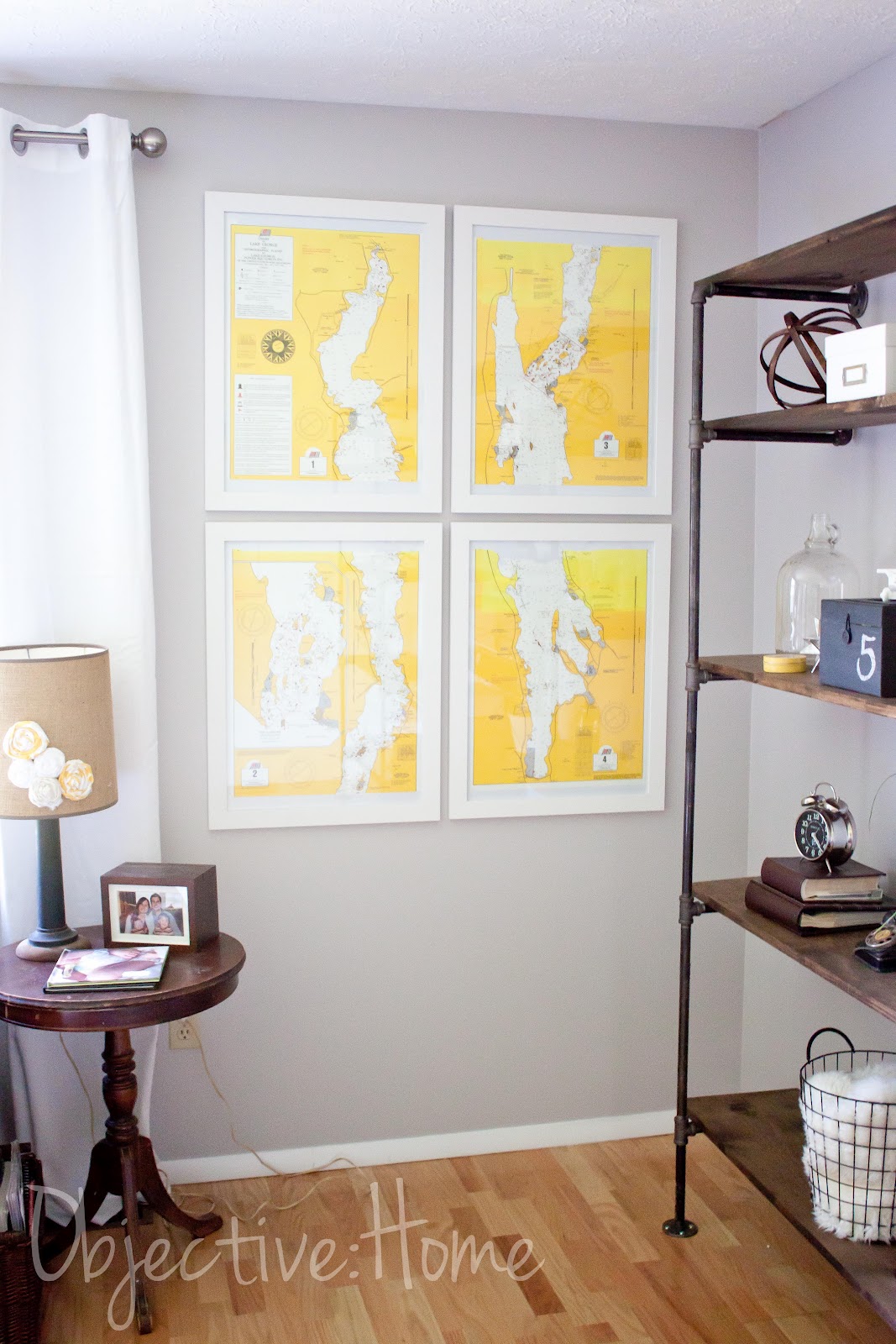
I made sure they were hung just high enough so that little children wouldn't knock into them accidentally. Yet they are still low enough to take care of needing any furniture on the wall. LOVE.

Here is an example of some of the ones you can find on Ebay on a daily basis. This one (there are lots like this) is a bit more subdued in color, but definitely gorgeous.

Up next is a set of four vintage National Geographic ads from the '50s that I stumbled upon. Again, I was on the lookout for a splash of yellow. I also wanted to add some black & white to help tie in the industrial/modern feel. The camera theme is running high in the room now, which I am totally digging. A couple '50s cameras on the shelving, and now four Kodak ads. There are two more, but they are for the unpainted wall, so you'll see those later. These are my favorite two though. GRRrrr with the slight crookedness!!

I love the vintage look, slightly yellowed and faded. I also think it's pretty neat that they all say Rochester, NY on the bottom (which you can't see here). Being that we are in Rochester and all, it is fun that they found their way back "home".


These were also a steal. I paid $2.99 each for them, and since they were from the same seller, I only paid the shipping for one. Woohoo! This is one of the other ones I picked up. I have no idea why it says sold for 5.99, since it was 2.99, but whatev. There is one more, another yellow one, that will hang with this one. The four frames were $5 a piece. So the total was $37 for all four framed pieces.

So. Point being. You can decorate your walls with unique, fun pieces for CHEAP! No one else has these exact sets and I love that. I love how unique the nautical maps are. I love that I didn't just pick them up at Target or wherever. They are one of a kind and completely cool. Take a look around Ebay, there are SO many great things that you can use to give your home personality. Vintage ads and maps ALLLLL over the place.

I'll be back soon with a whole bunch more advice on wall hangings, so watch out!

Thursday, May 10, 2012

High & Wide Baby.

Today I wanted to talk about a tip that has helped me quite a bit as I decorate our new home. If you're anything like I was/am, you are challenged in the drapery department. My mother in law worked for JcPenney Custom Decorating for something like 20 years, and I am sure she was appauled at my choice in curtains in our last house. I really had no idea what to do with windows. I suppose I didn't do THAT bad, I went with all white sheers and white romans. No biggie. Except for one big thing. I hung them low and narrow. GASP. As in, basically just covering my windows. Yikes.

So then, as I navigated the decor world over the years, I noticed a big trend that I was NOT a part of. Hanging your window treatments HIGH up on your wall and WIDE on your windows. Why was it not obvious to me before?? What a ginormous impact this single tip has on a room.

Want to make your windows seem twice as large? Make your ceilings feel higher? Room feel more grand? Make a statement instead of just being "there"? Well then my friend, here is your solution. Easy as easy can be too.

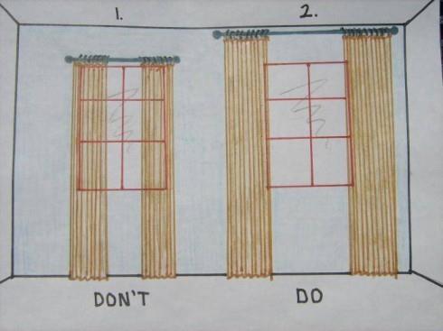
Here is an illustration, just so you can get the idea. When I saw this earlier last week, I just knew I was going to have to share it. Because as much as I know the difference, it was crazy to see it drawn out so simply.

This is from Elements of Style.

Now wontcha look at that! BAM. Can you believe that is even the same window???  Drastic improvement.

Along those lines, here are some of my tricks when dressing a window.

-Curtains should be either puddled on the ground a bit, or just touching the ground.

-Hang them within about 3-6 inches from the ceiling.

-That means, no more 84" inch panels. 95" all the way.

-Hang your rod wide enough so that the entire panel hangs just on the outside of the window frame. What I do, is have the panel approximately one inch over the window trim. So JUST covering the molding.

-You can either leave them as is, or if you want more privacy, hang roman shades. I hang  mine directly behind the curtain rod. Waaaaay up high on the wall. By doing this, you'll increase the height of the window and it will appear as though the window continues all the way up.

-With the romans, when they are open, open them so that they are JUST covering the top window molding.

-White panels ALWAYS work in a room. Always. If you have a dark space especially. I almost always go with white. I like to use white panels and patterned or bamboo romans (see HERE for my no-sew roman shade tutorial that has something over 18k Pinterest pins). White just brightens the space and again, makes the window seem much larger. Plus they are just so versatile and timeless. I like grommet top (if you plan on opening and closing them a lot especially) or back tab, which give you a nice pleated look. I steer away from tab top.

-If you want to add color or pattern and don't want to use a roman, you can use white panels and then cut one patterned panel down the middle and add them to the outside of the white panels. Giving you just a splash of color.

-For sliding glass doors, I do the same thing. Our deck slider has the rod hung right under the ceiling, with bamboo shades hung directly behind the rod. I used white grommet top panels so that they can be flung open and closed easily. The door looks WAAAAAAY bigger than when we moved in and vertical blinds were in place. YIKES. Stay away from verticals if you can at all help it. Talk about the '90s!

-For rods, I like large brushed nickel. As in, not the skinny skinny rods. I also like round finials. Classic, traditional, timeless. Honestly though, go with what suits your taste. Oil rubbed bronze and black are also nice.

Here are some examples of the window treatments hung in our house so far. We have only done the family room, master bedroom, kitchen, and partially the play room. I say partially because my plan is to make patterned fabric roller shades or romans. I just haven't gotten on that yet. I am working it around in my head, in terms of what color/pattern I want in there.

Playroom

This is the closest shot I have to a before. Before this though, the previous owner had frilly lace curtains hung directly over and on the window.

I would hang the curtains even wider than this if you can. I didn't because I was trying to use the rod I already had, which was stretched out as far as it would go. If I ever feel like it, I'll buy another rod and pull the panels out 6 more inches or so. Notice how I left the space between the rod and the window bare here. Works just fine. Shades to come eventually.


Master Bedroom

Again, closest I have to a before. This was the previous owners. Waaaaay too low. Too shiny. Mini blinds. Brass tiny rod.

Here is the other window.

After. BAM!!!! Can you even believe this is the same window???
Now I realize this is not the same window as the first photo. But, I haven't finished the other window and this one was dressed the exact same way as the other one was, before I took it all down for the photo above.
Notice the high bar, romans hung directly behind it and opened up right to the edge of the window. White panels hung completely on the outside of the window. This looks like a completely different window. Craziness.

Family Room

Before.
Previous Owners. So much wrong with this.

After
This was before we painted and moved the bookcase out of the room.

The room how it is now, from another angle. I don't know why I don't have a straight on shot. Whatev.

Here are some of my suggestions for inexpensive, versatile, white panels.

TARGET Grommet Top 95" FOR $35 (I have these in my family room and kitchen)

IKEA Back Tab 98.5" (comes with hem tape) for $10 a PAIR (these are the ones I have in my bedroom and playroom)

I think I've illustrated my point here. High and wide baby. Any other window treatment questions??

Thursday, April 26, 2012

Industrial Modern FUN

After a night full of working (mostly Steve) until 2am, we wrapped up the shelving unit! It looks 1000x better than I even imagined and I couldn't be any more thrilled with it. My incredible husband amazes me with his skills! He always works so hard to see my ideas and designs come to fruition. What a guy!

(Now, pardon the photos. I am a day or so away from being able to use my computer and Lightroom again, but for now I had to shoot in jpeg and do zero editing. So these are all straight out of the 'ol camera.)

Without further ado, here is our industrial/mid-century modern work of art. VOILA!

Don't mind the TV cords. Soon to be moved behind the TV.

Are you loving the gray wall as much as I am?? Again, we chose Sherwin Williams Grayish and it is perfect. Bright and light, with a touch of warmth, and it contrasts nicely with the white trim. It is a smidge off in color here, sorry, again, no editing. It is showing a bit greenish in the top two photos, but it is more warm and ZERO green in real life.

In terms of the styling, I am really enjoying how it is coming together. I am trying to blend loads of texture and keep everything earthy in color. Notice glass, metal, leather, lambskin, soft blankets, mirrors, paper, greenery, wicker, wire.

A bunch of the pieces I have found recently while antique shopping, some of them we've made or repurposed, and a couple of items we already had. I still have a fantastic Kodak camera from the '50s on the way from Ebay, as well as a really cool metal airplane. Other than that, this is it.

LOVE these '50s books I picked up last weekend for a buck or two a piece (Actually, the blue one is more recent, but looks super modern to me). Talk about great titles too!! "Fortune Is A Woman". Truer words were never spoken. ;) I painted that little wooden airplane that I snagged for $1.

Steve welded this nifty piece of artwork for me. Totally cool.

I am diggin' the mixture of soft/cushy with the wicker and metal and wood. Again, sticking with earth tones.
I picked up those wicker boxes at Michael's (last night actually) for 40% off plus 20% off with an entire purchase coupon. DEAL! They are perfect for holding all of our DVDs and our DVD player.

This awesome antique toy phone Steve and I discovered while on our day trip last month. The box is one I had that I painted with chalkboard paint.

These are all books I had. Camera for $5 last weekend. Spheres I made and featured HERE.

This cigar box I scored last weekend as well. Marked for $20 at the antique shop, I offered $10, she agreed. Woohoo! Perfect spot for the remotes and incredibly cool. 

All in all, a BIG success! It was surely a labor of love though. It took more time, more money, more stress, less sleep and a smidge of disagreeing (only natural right?) to get it done, but in the end, it is even better than I thought. 100% custom, totally unique, and crafted by hand by my amazing Stevie-Poo (sorry babe). 

Maybe I'll get more into the construction of it later (including more photos once we paint more than just that one wall), but for now, that's all folks! What's your favorite element/piece??

Oh, and a before and after, just for fun.

BEFORE

AFTER

Wednesday, April 25, 2012

Family Room Sneak Peek!

GAH!!! I'm so excited! Steve and I finally mustered up the energy to start back up on the family room shelving unit. We have been a smidge burned out lately and needed a minute to catch our breath. AHHHHH. So. Now that THAT is out of the way, onward!

Last night we set up the entire thing. Measured it, anchored it to the wall, put the unstained boards on it, hung the tv, and made sure we were happy. Ummmm. Happy? ECSTATIC! I didn't want to take it down!

Alas. We had to. Steve has to remove the two middle units in order to remove the boards to stain them. So it was just a sneak peek. But he managed to stain all the shelves last night and they are ready to go tonight. See? (iphone pics again, my computer is still on the fritz so I have no Lightroom)

Oh they look heavenly. Nice and dark cocoa-ish to pick up on the woodtones on the other side of the room in my desk and post office box. Coordinates so nicely with our coffee bean couches and contrasts perfectly with the white end tables and frames and the blue rug. I wanted them to look a bit distressed and aged, and Steve did such a great job. Love love love!

Here is what the piping looked like up, without the wood of course.

HUGE right??! I was surprised at how substantial they are! I mean, I knew it was going to be most of the wall, but it is hard to envision until you actually see them up. It is going to make SUCH a statement in the room and the entire first floor (this wall is visible throughout the floor). I don't even think you can tell that well from the photo, but they are lovely.

We are also planning on painting that wall tonight. Steve picked up the paint that I finally chose last night, and hopefully we'll whip that out this evening. We don't want to have to take the entire unit down again just to paint, so we'll do this one wall and then finish the rest soon.

Here is the color I picked.
Sherwin Williams Grayish. We color matched (like always) to Olympic Premium Latex paint since it is one of the only zero-voc paints with zero-voc colorant as well. Can't wait to see it up!! It is nice and light and bright and slightly warm to coordinate with all the warm brown tones we have in the room. Yet not beige-ish or too cool. I think it is going to be perfect with the industrial shelving. Hopefully tomorrow I can come back and show you! Maybe, maybe not. We'll see how much we get accomplished this evening.

Another really cool update for the room is in the artwork realm. I managed to snag four (fantastic!) nautical maps of Lake George NY on ebay this week. Graphic yellow. Gray. White. BIG. Annnnnnd $15 for all four. KILLER! I am going to frame them in the same frames that I used for the gallery wall and they will be grouped as a set on the wall where the old oak bookcase was. Here is a sneak peek.

PERFECT right??! I am in love. I had no idea they were going to be this lovely. What an absolute steal. Just when you think Ebay is lost and way overpriced. Wait until you see how incredible they are going to look all together.

I also have been wrangling some funky objects for the shelving lately. Today I painted a box I have been saving, with chalkboard paint. CB2 inspired! You'll see that soon. Lots going on here, and soon I'll have some more reveal photos to share. It is just so fun to see things coming together!

Friday, April 6, 2012

A Random Smattering of Goods.

After yesterday's post, both writing it all out like that, and hearing people's opinions/thoughts, we decided to go ahead with the mahogany. It will contrast nicely with the green when we replace the siding next year, and I think the dark, rich color will be perfect. As much as it will be hot, I remembered that the back of the house is facing north and doesn't get much sun until the evening. So that's good. I know it will show dry dirt and dust a lot, but I think overall, it's an alright trade off. One decision DONE.

Last week I also picked up some new lamps for our master bedroom. The lamps we were using were about a foot too short for our VERY tall bed and just were a pain in the neck to use. I was waiting for a sale at Target (where else), and finally I lucked out with a buy one, get one half off promo! Score. So I snatched up two of these babies (and lampshades of course).

I was trying to find lamps that were feminine & sparkly, yet not TOO in your face girly. I think they add the perfect touch of luxury and girl to the room.
 
Not to mention, they are tall enough for us to actually be able to read at night. Imagine that!

So pretty. I just love 'em. At under $35 a piece for the base and shade, they were a good price and make a big impact in the room.

Here is what the old lamps looked like.

annnnnnd the new! I love the height.

In other news (I'm all over the joint today), one of the next projects up is the dining room. Currently it is our staging room for things that haven't found a home since we've moved in/we won't be using anymore, as well as other random junk. Here is what it looks like right now.

Oh man, why am I showing this?? My brothers plants, random wall art that hasn't found a home, furniture we're not using, an old hideous chandelier, miscellaneous items for the new bookcase. Just craziness.

Yup. Craft supplies. Stuff to return to Target. Stuff to take to Goodwill. Baby carrier.

 I have a long to do list for this room, but mostly it is all quick and easy things that I can do myself. Or with just a little help. Here's the plan:

-Redo the chandelier (I can't wait to show you what I have up my sleeve!)
-Add crown molding (ok so Steve will be doing this one)
-Remove top part of white china cabinet and use it as a buffet instead
-Hang large mirror above buffet (again, that's a project you'll see later)
-Return huge antique dresser to my parents (it was perfect in our last home, but too big for here)
-Remove alll the junk of course (that's #1 on the list)
-Find a home for the bench in front of the window
-Add curtain and shades to the space
-Add wall art to the big blank wall where the dresser is now (again, another project you'll see)

All in all, it's not too bad! Down the line we also want to rip up the carpet and replace the flooring, as well as open up the wall into the entry way. But for now, just a few little things will make a HUGE difference!

The paint color is actually the ONLY color in the house I don't mind. It is a nice light gray. The color scheme for the room is going to be white/gray/black/silver. Very traditional yet with a modern, sophisticated twist.

You'll have to keep comin' back to see how things end up...

Have a great Easter weekend!

Wednesday, March 21, 2012

Adding A Bit More Playful To The Playroom

After we got a large chunk of the playroom done last month, and living with it for a few weeks, I decided it needed a bit more color. It was a whole heck of a lot of beige-white-neutral, and not enough BANG! THIS is a playroom! I think a playroom should be playful, for goodness sake. It should look very clearly like a room for kids. Colorful, bright, cheery, fun. At the same time, it IS still my home and I also need it to look presentable and not like a box of Crayola barfed all over the place. There is a fine line I think, and I wanted to figure out a way to liven it up yet stay away from that border.

Enter area rug. The room has wall-to-wall beige carpeting that was here when we moved in, and it left the main play space in the middle of the room looking so bare and plain and boring. I wasn't sure how it would go, throwing an area rug on top of plush carpet, but I took the plunge. It just really needed it! I am very pleasantly surprised at the results. It doesn't bunch much at all, nor does it move all over the place. I am planning on buying the carpet pad for underneath it to completely eliminate the wrinkling, but it is minimal enough that I haven't run out to do it yet. Take a peek.


It really defines and grounds the space! Instead of just a sea of beige, it brings a swash of sunny yellow in to center the room a bit. I am really liking it a lot. I purchased it from Home Decorators Collection online. It is 100% hand woven wool and it is flat woven and reversible. Yes! Reversible! So, not only will it last FOREVER being that it is wool, it will also hold up to kids because if it gets too gunky and drabby, I can flip that baby right over. SCORE.

Not only is it perfect for kids, but it was a great deal. I snagged this 5x8 beauty on sale (HERE) and with a coupon for $125, normally $200. PLUS I got free shipping. I was nervous buying it because it looks very bright and saturated online. I figured though, it was a great price and I could always return it if I didn't love it. Thankfully, it arrived and it was the perfect shade of mustard. PHEW!

As you can see, I also added that turquoise mirror above the play kitchen. I'll post more on that tomorrow actually. I have a bit more to do on that wall, but for now, it adds a Narnia-esque feel to the space. Which is very cool.

I also added a matching turquoise lamp and white garden stool in between the leather chairs. That space really needed a jolt of color because of all the neutral and white. It still needs a bit more, something. I am thinking about doing fabric roller shades (right now they are plain white cruddy plastic ones), but I have yet to find the exact fabric I am looking for.

Anyways, yes. I found that great lamp at Target on clearance (it was the last one!) and the drum stool/side table I picked up at Home Goods for $40. I LOVE it, but it makes the lamp a smidge too short for the chairs, so I might switch things up a bit.


I like how the turquoise pieces are opposite each other in the room. Coordinating, but not TOO matchy like if they were right next to each other.

I am happy with how things are coming together here. Very kid friendly, yet still grown up enough to be the first place people see when they walk in. I still have a couple little things I want to add to the wall with the mirror, to display the kids artwork and possibly a few books, but we'll see.

Among some of the other recent happenings, Steve switched out the ceiling fixture in the entry way for me. It was previously looking like this (this is before we moved in, clearly):

And here it is NOW:


It is a clean & simple, drum shade flush mount. Found HERE from Ikea. I love the texture, and at $29.99, you can't really go wrong. Steve was GENIUS and figured out a way to retro-fit it to the existing light fixture. So all we had to do was remove the glass on the old one and attach this one. No rewiring at all! Bonus.

So things are coming along well here. Adding bits and pieces all over the place. The nice weather the last week has had us focusing a bit on the exterior of the house, which has it's own to-do list. Tomorrow I'll be back to talk a bit more about the transformation of the mirror in the playroom. It went from hideous to cheerful for under $5!